Mosaic plot
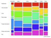
Mosaic plot is a graphical method for visualizing data from two or more qualitative variables.[1] It is the multidimensional extension of spineplots, which graphically display the same information for only one variable.[2] It gives an overview of the data and makes it possible to recognize relationships between different variables. For example, Independence is shown when the boxes across categories all have the same areas.[3] Mosaic plots were introduced by Hartigan and Kleiner in 1981 and expanded on by Friendly in 1994.[4] Mosaic plots are also called Mekko charts due to their resemblance to a Marimekko print.
As with bar charts and spineplots, the area of the tiles, also known as the bin size, is proportional to the number of observations within that category.[5]
Example
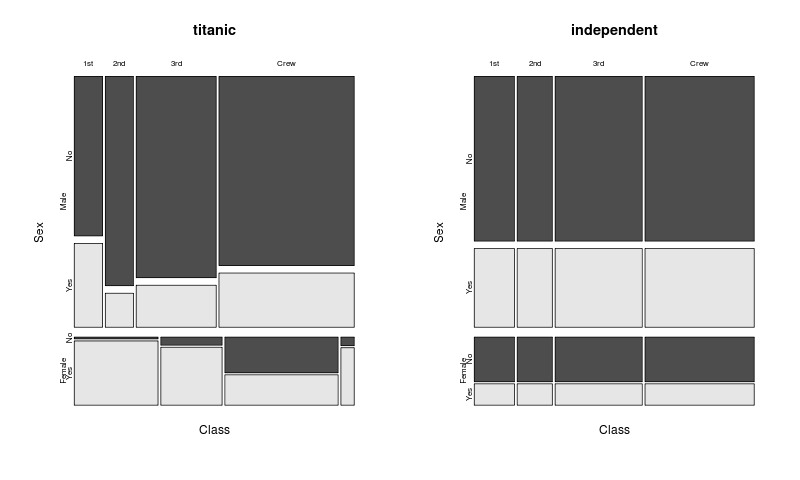
A classic example of mosaic plots uses data from the passengers on the Titanic. The data used for this example has 2201 observations and 3 variables. The variables are:
- the gender of the person (male / female)
- the class (1st, 2nd and 3rd class, or crew)
- did this person survive the sinking (yes / no)?
The observations were compiled into the following table:
| Gender | Survived | 1st Class | 2nd Class | 3rd Class | Crew |
|---|---|---|---|---|---|
| Male | No | 118 | 154 | 422 | 670 |
| Yes | 62 | 25 | 88 | 192 | |
| Female | No | 4 | 13 | 106 | 3 |
| Yes | 141 | 93 | 90 | 20 |
Mosaic plot construction
| Order | Variable | Axis |
|---|---|---|
| 1. | Gender | Vertical |
| 2. | Class | Horizontal |
| 3. | Survived | Vertical |
The categorical variables are first put in order. Then each variable is assigned to an axis. In the table on the right, sequence and classification is given for the example. Another order or assignment will result in a different mosaic plot, i.e., as in all multivariate plots, the order of variables plays a role.
At the left edge of the first variable "Gender" is plotted. All of the data are first divided into two blocks: The strip includes, among all females, the upper, larger block all male. One sees immediately that much less (about one quarter) of the people on the ship were female.
At the top of the second variable "Class" is applied. The four vertical columns are therefore for the four values of these variables (1st, 2nd, 3rd, and crew). These columns are not the same width. The width of a column indicates the relative frequency of this occurrence again. One can see that for men, the crew represents the largest group among women in the third class passengers were the largest group. There were only a few women crew.
The third variable "Survived" is shown on the right side and also highlighted by the color: The dark gray rectangles represent the people who did not survive the disaster. One sees immediately that the women in the first class had the best chances of survival. In general, the probability was the misfortune to survive higher for women than for men and for 1st class passenger higher than for the other passengers. Overall, about 1/3 of all people survived (light gray areas).
Properties
- The displayed variables are categorical or ordinal scales.
- The plot is of at least two variables. There is no upper limit, but too many variables may be confusing in graphic form.
- The number of observations is not limited, but not read in the image.
- The surfaces of the rectangular fields that are available for a combination of features are proportional to the number of observations that have this combination of features.
- Unlike, for example, the boxplot or QQ plot, it is not possible for the mosaic plot to plot a confidence interval. The significance of different frequencies of the various characteristic values can therefore not be observed visually.
See also
References
- ↑ Sandra D. Schlotzhauer (1 April 2007). Elementary Statistics Using JMP. SAS Institute. p. 407. ISBN 978-1-59994-428-9.
- ↑ New Techniques and Technologies for Statistics II: Proceedings of the Second Bonn Seminar. IOS Press. 1 January 1997. p. 254. ISBN 978-90-5199-326-4.
- ↑ Michael Friendly (1 January 1991). SAS System for Statistical Graphics. SAS Institute. pp. 512–. ISBN 978-1-55544-441-9.
- ↑ SAS Institute (6 September 2013). JMP 11 Basic Analysis. SAS Institute. pp. 251–. ISBN 978-1-61290-684-3.
- ↑ Martin Theus; Simon Urbanek (23 March 2011). Interactive Graphics for Data Analysis: Principles and Examples. CRC Press. ISBN 978-1-4200-1106-7.
Further reading
- John Hartigan, Beat Kleiner: Mosaics for contingency tables. In: Computer Science and Statistics: Proceedings of the 13th Symposium on the Interface. 1981, S. 268–273.