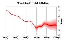
Fan chart (time series)
In time series analysis, a fan chart is a chart that joins a simple line chart for observed past data, by showing ranges for possible values of future data together with a line showing a central estimate or most likely value for the future outcomes. As predictions become increasingly uncertain the further into the future one goes, these forecast ranges spread out, creating distinctive wedge or "fan" shapes, hence the term. Alternative forms of the chart can also include uncertainty for past data, such as preliminary data that is subject to revision.
The term "fan chart" was coined by the Bank of England, which has been using these charts and this term since 1997 in its "Inflation Report" [1][2] to describe its best prevision of future inflation to the general public. Fan charts have been used extensively in finance and monetary policy, for instance to represent forecasts of inflation.
Implementation
Predicted future values can be diagrammed in various ways; most simply, by a single predicted value, and an upper and lower range around that (three lines total), or by various future intervals, depicted by varying degrees of shading (darkest near the center of the range, fainter near the ends of the range).
There are several ways to represent the forecast density depending on the shape of the forecasting distribution.
- If the forecast density is symmetric (normal or Student's t, for instance), the fan centers at the mean (which coincides with the mode and median) forecast, and the ranges expand like confidence intervals by adding and subtracting multiples of the forecasting standard error to the mean forecast. These ranges are known as equal-tail ranges and centre at the mean forecast. Low resolution charts may add and subtract one, two and three forecasting standard errors for approximate coverages of 68%, 95% and 99.7%. These charts can easily be built through standard Excel graphs.
- If the forecast density is non-symmetric, centering the fan at the median and using equal tail ranges might not be appropriate as it would overstate the forecast uncertainty. In this case it is better to center the fan at the more likely forecast (the mode) and use Highest Probability Density (HPD) ranges.[3] HPDs are by definition the shortest ranges covering a given probability, say 50%, and are centered at the mode. In this case it is usual to include increasing probability ranges of 10%, 20%, …, 90%, for instance.[4][5]
In the Bank of England’s implementation it is assumed that the forecast distribution is a two piece normal or split normal density.[6] This density results from joining the two halves of corresponding normal densities with the same mode but different variances. As a result, the split normal density is non-symmetric and uni-modal. In this case, inflation forecast fan charts are usually accompanied with the balance of risks, the probability that the future inflation falls below its modal forecast. In this way, central banks that employ inflation targeting report to the general public not only the more likely forecasts of the inflation rate but also its balance of risks![7]
The split normal density is completely characterized by three parameters, the mode, variance and skewness. Therefore, the fan chart ranges depend on these parameters only.[4][5][6] and [8]
In a central bank that employs inflation targeting, the three moments of the inflation forecast distribution are determined as follows:
- The mode. Modal forecasts are derived from the suite of models of the central bank.
- The variance. Standard errors of forecasts might be derived from appropriately formulated forecasting models but it is advisable to derive them from historical forecasting errors instead.[2]
- The skewness. A mapping from the skewness (or balances of risks) of factors that affect the inflation rate along the forecast horizon to the skewness of the inflation forecast distribution has to be specified.[7]
References
- ↑ Bank of England, Inflation Report
- 1 2 Britton, E.; Fisher, P. & J. Whitley (1998). The Inflation Report Projections: Understanding the Fan Chart (PDF). Bank of England Quarterly Bulletin. Retrieved 2011-03-15.
- ↑ Casella, G.; Berger, R. (2002). Statistical Inference (second ed.). Duxbury Press.
- 1 2 Julio, J. M. (2007). The Fan Chart: The Technical Details Of The New Implementation. Banco de la República. Retrieved 2010-09-11, direct link
- 1 2 Julio, J. M. (2009). The HPD Fan Chart with Data Revisions (PDF). Banco de la República. Retrieved 2011-03-08, link to software
- 1 2 John, S. (1982). "The three-parameter two-piece normal family of distributions and its fitting". Communications in Statistics - Theory and Methods. 11 (8): 879–885. doi:10.1080/03610928208828279. Retrieved 2011-03-09.
- 1 2 Blix, M.; P. Sellin (1998). Uncertainty Bands for Inflation Forecasts (Working paper). Sveriges Riksbank. Retrieved 2011-03-11.
- ↑ Kotz, S. Johnson, M. and N. Balakrishnan (1994). Continuous univariate distributions. 1. John Wiley & Sons. Retrieved 2011-03-11.
External links
- Inflation Report Fan Charts, Bank of England
- Fan chart, MATLAB Central, by Marco B., 23 May 2010
- fanplot, CRAN R Package by Guy J. Abel, 9 April 2013